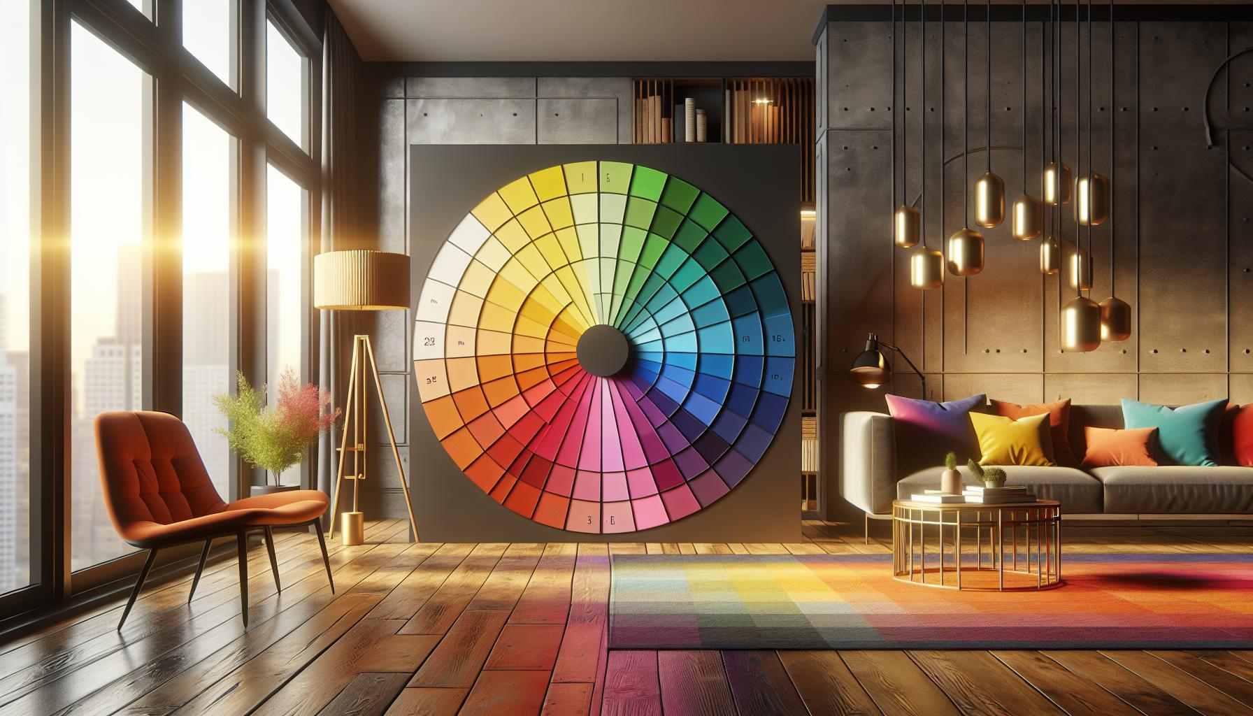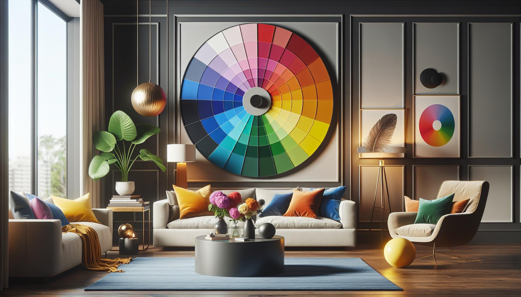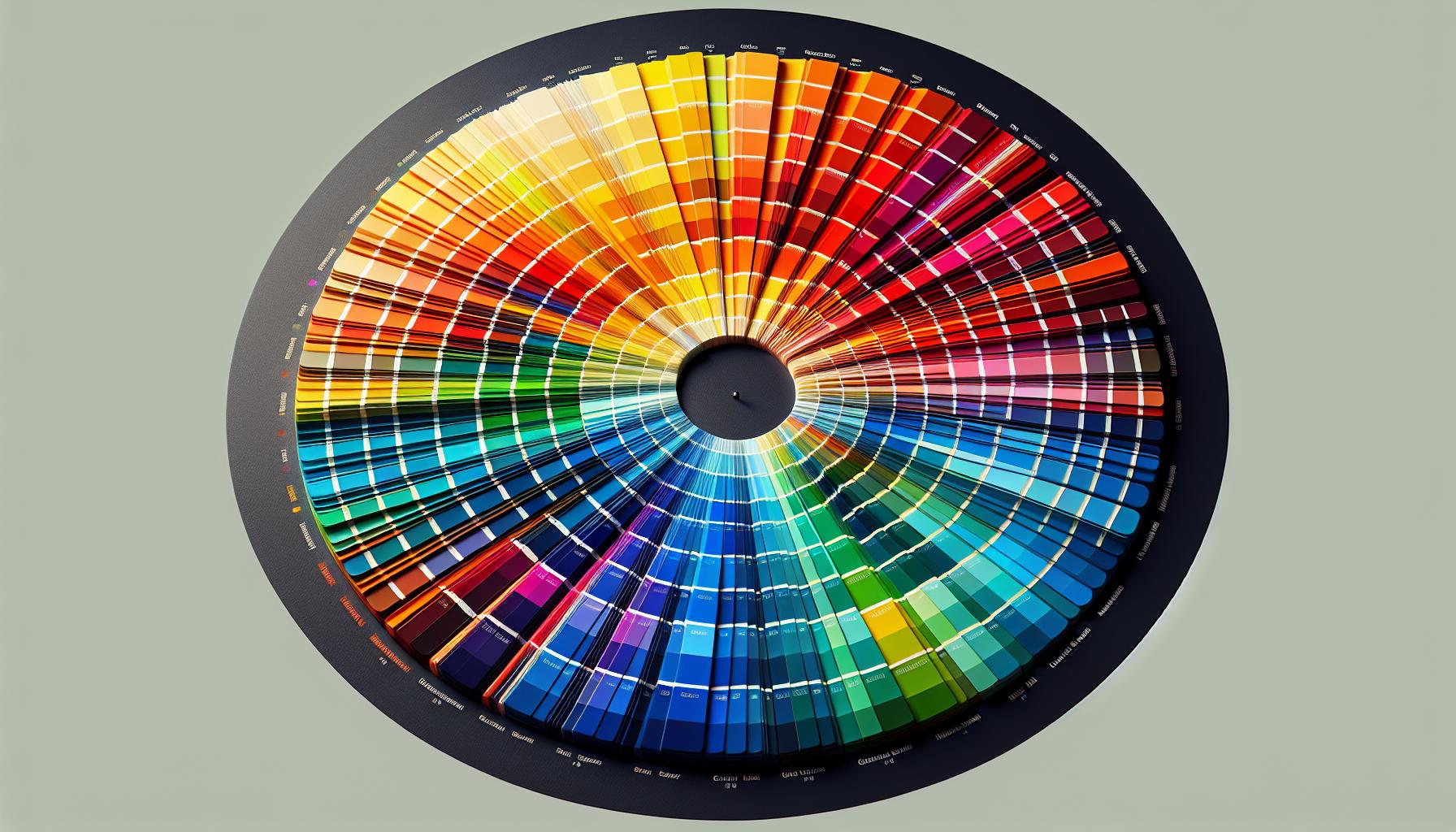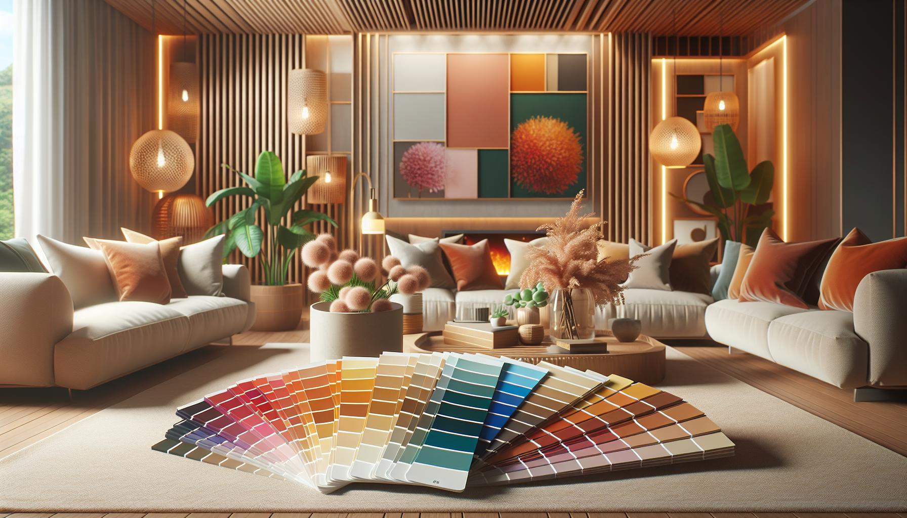
When diving into the world of interior design, one of the most powerful tools at your disposal is the color wheel. I’ve always found it fascinating how a simple circle of colors can transform a space, bringing harmony and balance to any room. Whether you’re refreshing a single room or revamping your entire home, understanding the color wheel is key to creating a cohesive and inviting atmosphere.
The color wheel isn’t just about picking your favorite hues; it’s about understanding relationships between colors. By learning how colors interact, you can create stunning combinations that evoke the right mood and complement your personal style. From bold, dramatic contrasts to soothing, monochromatic schemes, the possibilities are endless. So, if you’re ready to elevate your interior design game, it’s time to explore the magic of the color wheel.
Key Takeaways
- The color wheel is an essential tool in interior design, helping to create cohesive and inviting spaces by illustrating relationships between colors.
- Understanding primary (red, blue, yellow), secondary (green, orange, purple), and tertiary colors enhances design choices, providing opportunities for dynamic or tranquil environments.
- Color harmonies, including complementary, analogous, and triadic schemes, play a crucial role in crafting visually appealing and balanced spaces.
- Colors have psychological impacts: warm colors like reds and oranges evoke energy, while cool colors such as blues and greens promote calm and relaxation.
- Applying the color wheel strategically in home interiors, from wall colors to furniture and accessories, achieves aesthetic balance and harmony.
- Beginners should start with complementary and analogous color schemes, consider the emotional effects of colors, and use the 60-30-10 rule to balance colors in a space effectively.
Interior Design Color Wheel
The color wheel serves as a vital tool in interior design, illustrating the relationship between colors. Developed by Sir Isaac Newton in 1666, it’s evolved into a comprehensive model that guides designers. A typical color wheel includes 12 colors, comprising primary, secondary, and tertiary colors.
Primary colors, red, blue, and yellow, can’t be created by mixing other hues. Secondary colors, green, orange, and purple, result from mixing two primary colors. Tertiary colors arise when mixing a primary color with an adjacent secondary color, resulting in shades like red-orange and blue-green.
Designers use the color wheel to create harmonious palettes. Complementary colors, like blue and orange, sit opposite each other on the wheel, creating high contrast and visual interest. Analogous colors, such as blue, blue-green, and green, appear side by side for a cohesive and serene look. Monochromatic schemes use various shades and tints of a single hue, offering simplicity and elegance.
In interior design, the color wheel assists in maintaining balance. Warm colors, like red and yellow, evoke energy, while cool colors, such as blue and green, promote calm. By using this tool, I select combinations that enhance a room’s mood and function, ensuring spaces are both stylish and comfortable.
Primary, Secondary, and Tertiary Colors

Understanding primary, secondary, and tertiary colors enriches interior design by enhancing color choices. These color categories form the basis of the color wheel, an essential tool for designers.
Definitions and Examples
Primary colors are the foundation of the color wheel, consisting of red, blue, and yellow. These colors can’t be created by mixing other hues.
Secondary colors emerge by blending two primary colors: green (blue and yellow), orange (red and yellow), and purple (blue and red).
Tertiary colors result from mixing a primary and a secondary color, yielding combinations like red-orange and blue-green.
Importance in Design
The utilization of primary, secondary, and tertiary colors influences interior design significantly. Primary colors offer striking statements and vivid focal points. Secondary colors introduce softer contrasts and transitions. Tertiary colors provide depth and complexity, harmonizing the color scheme. Together, they allow designers to craft spaces that reflect mood and personality, offering versatility in creating dynamic or serene environments.
Color Harmonies in Interior Design

Color harmonies play a crucial role in crafting visually appealing and balanced spaces. The concept revolves around using the color wheel to choose palettes that enhance a room’s ambiance.
Complementary Colors
Complementary colors are opposite on the color wheel, like blue and orange or red and green. They create high contrast and draw attention, perfect for accentuating features or creating vibrant energy. In a living room, a blue sofa might be paired with orange cushions for a pop of contrast.
Analogous Colors
Analogous colors sit next to each other on the wheel, such as blue, blue-green, and green. They offer cohesion and a serene feel, ideal for spaces where relaxation is key. In a bedroom, these colors can be layered through bedding and wall art to promote tranquility.
Triadic Colors
Triadic color schemes involve three evenly spaced hues on the wheel, like red, yellow, and blue. These combinations provide a vibrant yet balanced appearance, adding dynamic energy to any room. In a kitchen, using triadic schemes can manifest in colorful cabinetry and decorative accessories that spark creativity.
Psychological Impact of Colors

Colors influence emotions and behaviors in subtle but powerful ways. Understanding their psychological impact enhances interior design effectiveness.
Warm Colors
Warm colors, such as red, orange, and yellow, often evoke feelings of warmth and excitement. Red can increase energy and stimulate conversation, making it ideal for social spaces like living rooms. Orange conveys enthusiasm and creativity, often used in areas needing inspiration. Yellow signifies happiness and sunshine, which can uplift moods in kitchens or entryways.
Cool Colors
Cool colors, like blue, green, and purple, usually promote relaxation and calm. Blue is known for its soothing properties, often used in bedrooms to aid restfulness. Green represents growth and renewal, making it perfect for spaces intending harmony, like home offices. Purple adds a touch of sophistication and luxury and works well in areas like dining rooms.
Using the Color Wheel in Home Interiors
The color wheel serves as a vital tool in home interiors, guiding the selection of hues. When applied strategically, it helps achieve aesthetic balance and harmony in your living space.
Wall Colors
Walls form the canvas of a room, setting the tone. Using the color wheel, you can select a wall color that complements your existing décor or creates the desired mood. For a serene environment, choose analogous colors such as blues and greens. If seeking vibrancy, opt for complementary colors like orange and blue to create dynamic contrast. Monochromatic schemes, using different shades of a single hue like various grays, can offer a sophisticated and understated look.
Furniture and Accessories
Furniture and accessories further define the room’s character. The color wheel aids in picking pieces that enhance overall color harmony. Incorporating analogous colors in upholstery and throw pillows can provide cohesion and subtle flair. To draw attention, select complementary colors for standout items such as a bold red sofa in a predominantly green room. Accessories like artwork or rugs using a triadic scheme, such as red, yellow, and blue, contribute a lively and balanced energy.
Practical Tips for Beginners
Understanding the basics of the interior design color wheel is essential. Start by familiarizing yourself with the 12 colors: primary (red, blue, yellow), secondary (green, orange, purple), and tertiary (like red-orange). This foundational knowledge aids in creating visually appealing designs.
Explore complementary color schemes first. These involve using colors opposite each other on the wheel, such as blue and orange, to create striking contrasts. This approach works well for accents and focal points in a room.
Experiment with analogous color schemes. Choose colors located next to each other on the wheel, like green, blue-green, and blue, to create a harmonious and cohesive atmosphere. This method is excellent for a calming or unified look.
Venture into monochromatic designs by selecting varying shades and tones of a single hue. For instance, using different blues adds depth and interest while maintaining a serene environment.
Remember the psychological impact of colors when choosing a scheme. Understand that warm colors enhance energy and excitement, while cool colors promote tranquility. Use this knowledge to align color choices with the intended mood of the space.
Balance color usage through the 60-30-10 rule. Allocate 60% to a dominant color, 30% to a secondary color, and 10% to an accent color. This balance ensures a well-proportioned and visually appealing space.
Sample paint swatches and fabrics before making final decisions. This aids in visualizing how colors appear in specific lighting conditions, ensuring the chosen palette harmonizes with the room’s natural and artificial lighting.
Endless Possibilities for Creating Interiors Designs
Exploring the color wheel opens up endless possibilities for creating interiors that are both visually stunning and emotionally resonant. By mastering color relationships, we can craft spaces that not only reflect our personal style but also evoke the desired mood and atmosphere. Whether you’re aiming for a serene retreat or a vibrant living area, the color wheel provides a reliable guide to achieve balance and harmony. Embrace the versatility of primary, secondary, and tertiary colors to enhance your design projects and transform any space into a true reflection of who you are.
